


Brand Practice
- May 2, 2017
- 3 min read
Starting a blog is an exciting yet daunting prospect. After all, it's not just a blog - it's an entire brand, complete with a logo, color scheme, typography and site design. This blog has been a great chance to practice. Brand practice, if you will!
It all started with the name. I had the concept of the blog to begin with, an outlet for my creativity and to showcase some of my projects. It would deal with creativity, making things, ideas, and art. The Endangered Creative was actually the very first name I wrote down, but it was far from the last. Some of the others on my brainstorm list include: The Creative Process, Brain Fart, Occasional Creativity, Confessions of a Deprived Creative, On Again, Off Again, Brand Practice (Which became the title of this post!), Art and Soul, I've Got Your Knack, Make it Brain, Creativity & Creativity First, and Another Art Blogger. As you can see, I was leaning towards something punny - during the brainstorm process I used a rhyming dictionary and thesaurus heavily - but for one reason or another none of them seemed like me, or the vision and plan I had for the blog. The Endangered Creative not only sounded right, it succinctly summed up the blog theme and was unique enough to not be a repetition of a different blog or brand.

With the name chosen, next up was a logo. It was tough at first - how does one sum up creativity in a simple stylized way? What is an image that means endangered? How on earth does one combine the two?
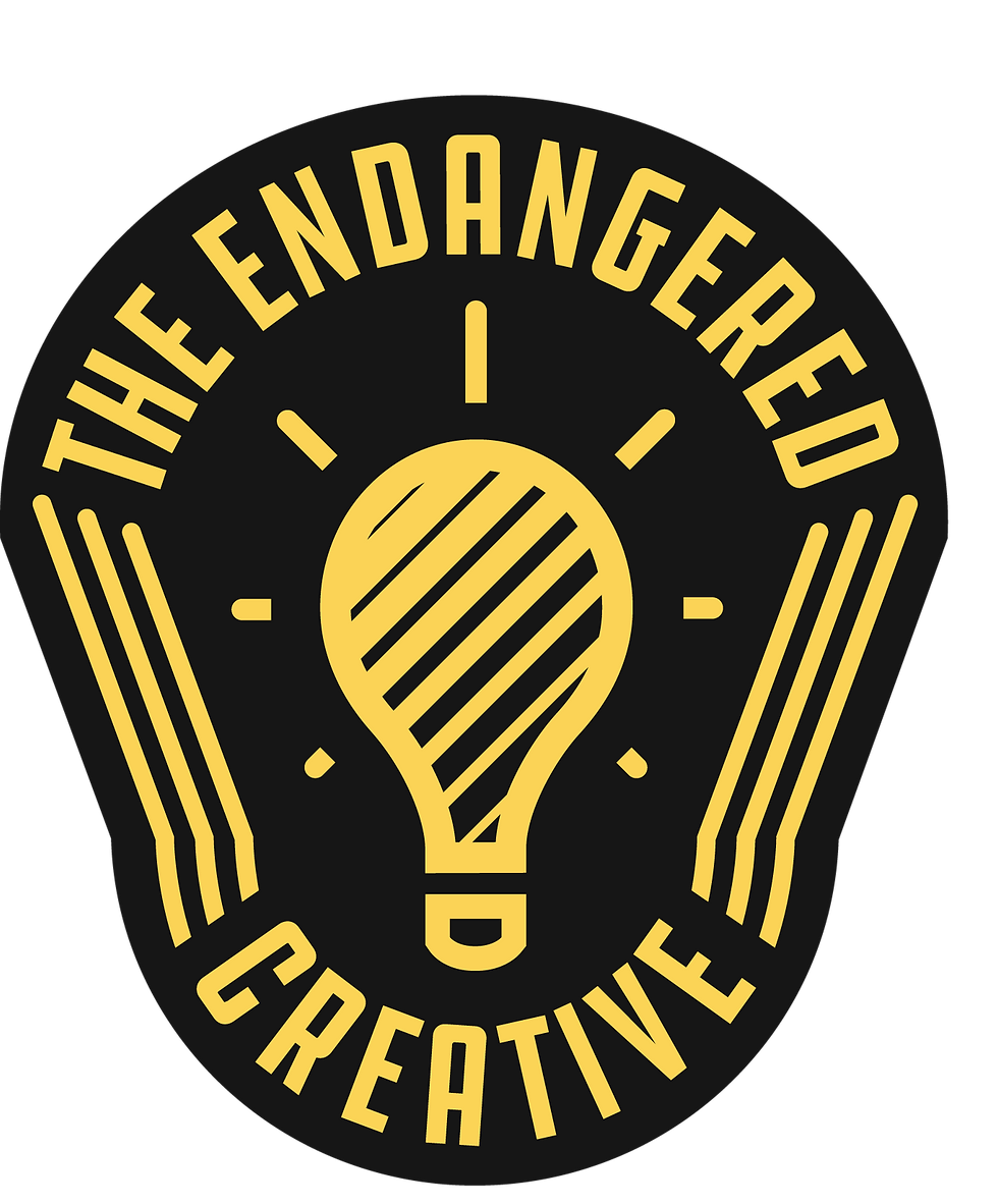
I started out with a lightbulb. Lightbulbs ubiquitously signal creativity, at least in my mind, so that was a good starting point. Endangered conjures images of panda bears, globes, and the color red. Attempting to juxtapose both concepts brought about some interesting sketches; a lightbulb inside of a globe, sniper cross hairs made from a paintbrush and pencil, a panda face made from lightbulbs, and the final idea, a disappearing lightbulb.
The lightbulb required a lot of fine-tuning, especially the diagonal stripes inside said lightbulb, which were meant to depict it's disappearance. The spacing was tough, but once the lightbulb was finalized the badge shape followed. At first I had a more elongated, tall badge shape, like so:

I wasn't sold on the typography, though, and a friend correctly mentioned that the rays of light on the sides were too close to the three lines on either side.
After choosing a more suitable typeface and some kerning, I re-did the badge shape, which caused me to change the shape of the three lines on either side, which fixed the spacing between the light rays and the lines. This resulted in the final version of the logo, as seen here:
So, there you have it, the origin story of The Endangered Creative; name, logo, brand. Fairly simple, but I really do like how it turned out. Hopefully you do, too - and, if you're so inclined, you could purchase the logo on a t-shirt, right now over at Teepublic!
What are you working on creatively at the moment? Have a question about the branding process? Shoot me an email and tell me all about it! theendangeredcreative@gmail.com
Or, post about it on the FB page!
Comments